I was recently asked to review a report summarizing the historic performance of a pharmaceutical process. The report consisted of the usual data tables and charts, but one thing caught my eye: data for each critical-to-quality product characteristic examined were plotted on control charts as well as on x versus y scatter plots with regressed trend lines. This seemed kind of odd to me... I am used to seeing both control charts and regression charts to analyze data, but not together for the same data.
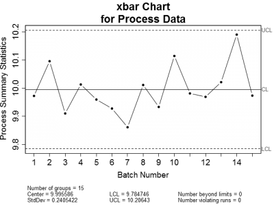
This got me thinking. When is it appropriate to use control charts or regression to analyze process data? Let's look at an example of an in-control process. Figure 1 is a set of control charts plotted for a typical in-control process. Nothing looks amiss on either chart. All of the plotted points fall within the calculated control limits and there are no readily apparent trends.
 |
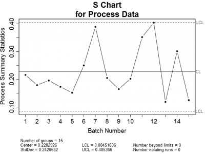 |
| Figure 1: X-bar and Sigma Control charts for a typical in-control process. Notice that all plotted points are within the upper and lower control limits. | |
Now let's look at the same data regressed graphically. Figure 2 shows the in-control process data plotted on a standard x versus y scatter chart. The plot includes confidence and prediction interval bands as well as a trend line representing the best fit line through the data.
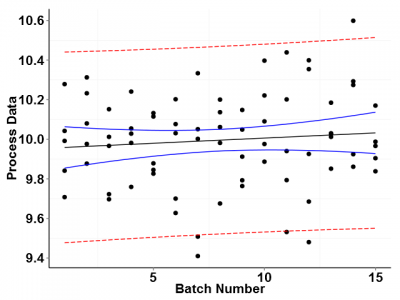
We have already established through control charts that the data are in control, but looking at Figure 2 it appears that there is a slight upward trend in the data. Is this trend meaningful? Probably not. This apparent trend is most likely due to the random error in the data.
Because we only have a limited number of batch data to work with, the confidence band for the predicted response at each batch is fairly wide. With a given probability, the true data trend line could lie anywhere within the confidence band. The plotted trend line just represents the most probable location of the trend line given the available data.
So what happens if we plot data that trends in some direction according to a predictor value? A good example of this is the stability of a pharmaceutical product over time. Active ingredients for many drugs deteriorate over time; hence the need for establishing expiration dates.
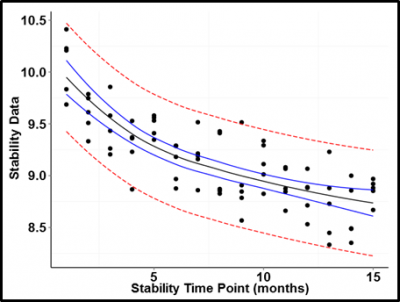
Figure 3 is an example of an active ingredient assay plotted over time. The trend is easily modeled as a log function of time. Even given the uncertainty of the predicted values, it would be impossible to find a trend line falling within the calculated confidence bounds that did not show a clear trend downward over time.
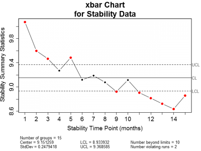
Now, as with the in-control process data, let's also plot the stability data on x-bar and sigma control charts (Figure 4). Obviously, the x-bar control chart shows the stability data to be out of control. The majority of the points plotted fall outside of the control limits. The sigma chart, on the other hand has no points outside of the control limits.
 |
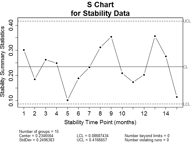 |
| Figure 4: X-bar and Sigma control charts for stability data. Notice that the majority of the plotted points on the X-bar chart fall on or outside the upper and lower control limits while all of the points plotted on the Sigma chart are within the control limits. | |
But this makes sense. Where we already know or suspect that the response is likely to be correlated to some predictor—which in this case is stability time point—we should not expect the data to be in a state of statistical control. Remember that the simplest definition of statistical control is a process free of influence other than that due to random variation. In the case of stability, we are interested in characterizing the effect of time on product quality, not the state of control.
So, whether or not we choose control charting or regression to monitor a product characteristic of interest depends on the question we are asking. If the question is, "is the process output in a state of statistical control," then control charting makes the most sense. On the other hand, if the question is, "are the data correlated to a predictor," then regression is the best bet.
While control charting and regression of the same data is not technically wrong, there is little value to be gained by doing both and, in the end, may cause needless confusion. If all that we are trying to prove is whether or not a process is in control, then use a control chart. If a data trend due to some predictor is suspected and a control chart is still desired, then plot the data on an x versus y scatter plot with a prediction band (see figure 3). Then use the upper and lower bounds of the prediction interval band as the control limits for the trended data.
Learn more about ProPharma Process Validation services. Contact us to get in touch with our subject matter experts for a customized presentation.
